Psychology of colors
The concept of the psychology of colors is ancient. Knowing color psychology in various fields is a hot topic in the contemporary age. Now, people consider it crucial to explore the psychological effects of color in marketing, branding, art, and design.
As a result, experts and researchers are making more observations and discoveries about the psychology of colors. They have shared various effects of colors on human feelings, moods, and behaviors.
Colors have a profound impact on all aspects of life. They are a powerful communication tool; colors greatly influence our actions, moods, and psychological reactions. They are associated with our pleasures and sorrows.
Everyone has deeply personal feelings about colors; your associations with colors are rooted in your priorities, experiences, and culture.
For instance, white represents innocence and purity in many Western countries. But in many Eastern countries, it’s a symbol of mourning. So, one cannot pack a vast topic like the psychology of colors in a few words.
In this article, we will have a detailed discussion on the topic. Let’s glance at what information the oncoming lines carry for you.
Table of Contents
What is the psychology of colors?
Color psychology is an essential element of color theory. This theory builds an attractive connection between colors and emotions. Colors have aroused tons of curiosity in human beings. That’s why we are familiar with what color delivers what response.
So, it is advisable to discover what colors are favorite by one culture and non-accepted by the other.
Sometimes, a hue expresses many connotations for you. For example, you intend to wear an orange blouse today because:
- It boosts your mood
- You desire to look captivating
- You feel creative
- You want to perform.
What is the most robust color psychologically?
When studying the psychology of colors, red stands at the top of the list. However, yellow is second to none and is psychologically the most robust color. It’s a symbol of a happy mood, comedy, and merriment.
Nineteen century recalls yellow ribbons as a token of optimism and hope, according to Wright (1998). The strongest color, yellow, also preaches creativity, self-esteem, and emotions. Do you know?
- Light pastel yellow appears to be childlike
- Canary yellow looks feather soft and delicate.
- Ambered yellow conveys warmth and maturity.
- Yellow color connects closely with words such as joyful’, sunny, happy, and cheerful.
- Also, connected with (to some extent) stimulating excitement.
- Yellow hue doesn’t know unhappy, dejected’ ‘melancholy,’ despondent’ mean
- Yellow as a hue allows tons of sunlight to come in.
Therefore, yellow has collected tons of grace and significance in interior design!
What colors are psychologically attractive?
Color psychology is a hot topic. While associations with colors are rather personal, some perceptions have universal connotations. Among the host of colors, red is the pigment that attracts viewers’ attention. It indicates strong emotions like love, anger, and passion.
This universal pigment signifies power, strength, bravery, and danger. It’s vibrant and stimulating and denotes a strong bond with appetite and sexuality. It develops confidence and shelters shyness in those who lack energy and willpower.
So strengthen your powers by wearing red!
What colors cause anxiety?
Color psychology decides what shades leave what effects. They have the power to lift your mood to induce anxiety. So, knowing the psychology of colors helps you choose the colors for your dressers or designs wisely.
Here are the hues that cause stress and anxiety:
- The color gray shows a link with melancholy, tension, and anxiety.
- Blue light therapy is also claimed to promote anxiety and mood swings.
- Long-term stay in red environments leads to stress and depression.
Considering the above discussion, avoiding uninviting colors will be an intelligent decision.
What color makes the brain happy?
The psychology of colors explores secret facts about colors and helps you pick the right hue. Have you ever felt happy when you enter a hotel or restaurant? This sudden euphoria may be due to the colors sprinkled in that environment.
You can observe the colors in your surroundings when you are happy. You will realize that you respond to those colors psychologically and positively. Everyone can change moods with colors. So here’s the secret color that makes your brain happy.
The happiest color under the sun is yellow.
This esteemed honor of this shade is not without a reason. Yellow color has grabbed its various psychological powers being linked to the sun.
Other than this, pastel colors like light pink, lilac, and peach also leave a soothing effect on your mood!
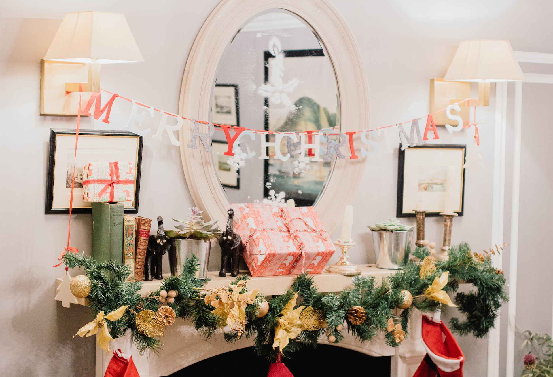
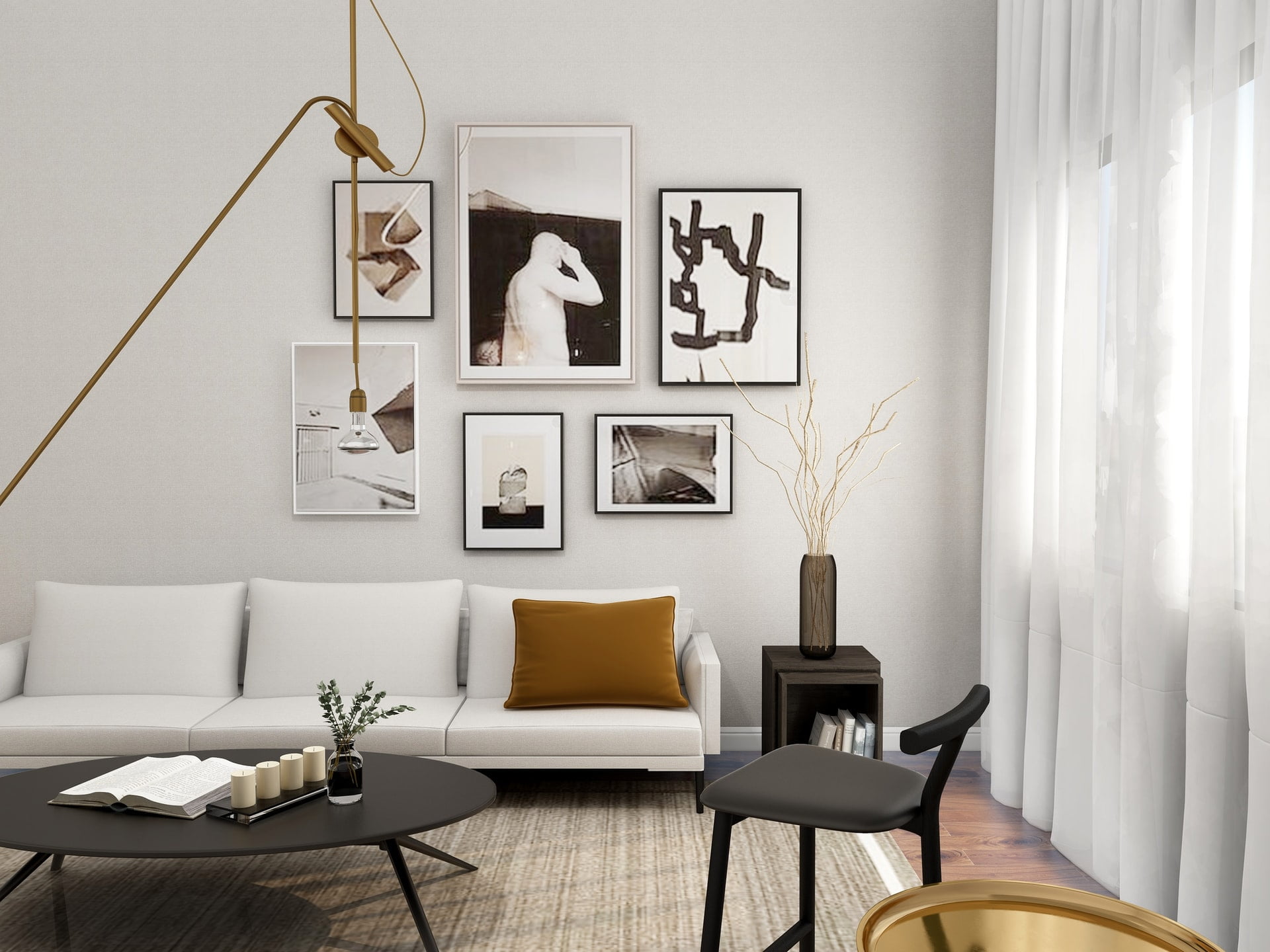
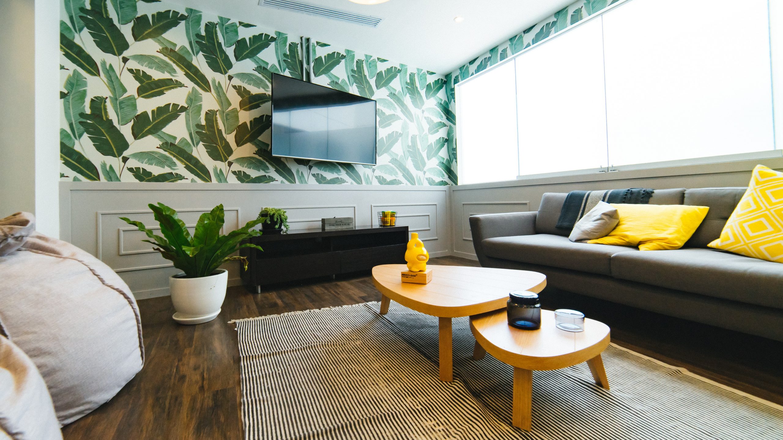
How to use color psychology in interior design?
Interior designers must focus on the psychology of colors to create a comfortable and warm ambiance. Room colors, wall colors, and the overall colors in the interior contribute to making or breaking the inner atmosphere. Different shades arouse different emotions. So, be vigilant when choosing colors for your interior. Think wisely about what environment can soothe your nerves and inspire you to positive action. For example:
- Yellow steals the warmth of the sun and creates positivity. It’s an ideal choice for dining rooms, Kitchens, and bathrooms.
- Red instantly books your attention and elevates a room’s energy level. It will be a perfect shade for creative corners and home offices.
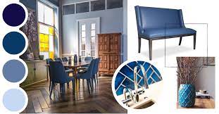
- Blue shades are best for home sections where you want to relax.
- You can create a calming and serene bedroom and bathroom with a touch of blue.
- Green brings nature to mind and promotes a soothing and comfy environment.
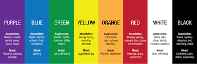
- Purple delivers positive emotions, nobility, and creativity. So try to spruce up your hallway with purple. This unique hue will fascinate your guests at the first opportunity.
Color psychology research
Scientists have studied the psychological effects of colors in various fields. Studies reveal that even businesses depend on a better choice of colors for their progress. So, without further delay, I will throw light on color psychology in several fields.
Psychology of colors in marketing
The psychology of colors in marketing carries excellent prestige. The visual appearances of your products influence 93% of the buyers. Each color attracts visitors with a unique psychological effect. Do you know that color is the primary draw card for more than 84% of buyers? So, the psychology of colors in marketing is a great tool to appeal to the visitors’ visual senses.
Research shows that consumers get a different impression of each particular color. Some colors impact some segments of your brain to boost tranquility and excitement. At the same time, some colors have a magical effect on visitors to convert them into customers. Corporations and brands employ attractive combinations of colors to hook visitors. What color combination are you thinking to spot your customers on your website?
Psychology of colors in branding
The power of color psychology in branding means how the customers see brand colors that have a powerful impact on our emotions. These emotions build our behavior as customers. It is this power of colors the brand owners use to grab their customers’ attention.
Brand color psychology is a framework to perceive how the consumer interacts with brands. For example, the red color in the base instantly catches customers’ attention.
What do colors mean for branding?
- Red: warmth, passion, attention, grabbing, stimulating
- Green: healing, soothing, environmental, fresh, trans quality
- Yellow: happiness, curiosity, joy, warmth
- Blue: confidence, trustworthiness, dignity, calming, loyalty
- Orange: creative, youthful, affordable, light-hearted
Among the host of colors, red, green, and blue are the top colors that attract customers in branding.
Psychology of colors in business
- What is the best color for business?
- What colors attract affect customers to your business?
- How do companies use color psychology?
- What do colors symbolize in business?
Color psychology in business is a significant element of research. Find out how colors shape our behavior and influence decision-making.
For example, different colors develop buyers’ perceptions of a brand. Similarly, certain hues add to appetite. Some pigments soothe our senses and relax our nerves. So, it is important to know the best color for business.
An important research suggests that colors “make a subconscious judgment about a person, environment, or product within 90% seconds of initial viewing and between 62% and 90% of that assessment is based on color alone.”
Now, without delay, I would let you know what color is the heart and soul of business.
Blue is your best option to be perceived as trusted, confident, and calm. It is a soft, relaxing, and essential color for business.
Psychology of colors in graphic design
What is color psychology in graphic design?
Color psychology, line psychology, font psychology, and shape psychology all contribute to the success of your designs.
What color do you recall when you hear ‘Coca-Cola’ and ‘McDonald’s?’
The brand owners cash your behavior and emotions that their logo colas produce in your brain. Factors like upbringing and history play a crucial role in realizing the effects of colors. But we can make some generalizations about how people respond to a specific color.
The designers are super conscious about the psychology of colors in graphic design. This is because more than 90% of customers make buying decisions because of visual cues. So, the designers need to know about their client’s target audience before creating a design.
Pro Tip!
The single-color design looks sophisticated and modern. However, it fails to arouse consumers’ curiosity because of its simplicity. So think out of the box! Inject more captivating colors into your graphic design to hit your target audience!
Color psychology for restaurant design
The restaurant owners excite the feelings of thirst and hunger by using the psychology of colors in restaurant designs. Different colors stimulate various feelings and emotions. Similarly, some colors can make you feel hungry. Here are those secret colors that increase your appetite.
Red: Many restaurant designers use this bright, energetic hue because it inspires your senses. The activation of the senses consumes many calories that directly increase your hunger.
Yellow is also a famous color for restaurant designs. I haven’t visited a restaurant yet that missed yellow in their décor. So, do not miss the yellow hue if you aspire to elevate your restaurant business.
Here are 5 best restaurant design tips:
- Imagine yourself as a guest when designing your restaurant.
- Remember, little things are essential.
- Be sincere to your brand.
- Don’t skimp on storage.
- Visual is not the only thing.
Now, I must unveil what makes a good restaurant design. Or what are some good themes for a restaurant?
- Fast food
- For dining
- Pop up restaurant
- Family style
Employ the psychology of colors in the best way possible when crafting your restaurant. Here’s one more super lovely tip.
Restaurants should never sprinkle blue color in their visual design. It’s not a natural food color and can vanish your customers’ appetite.
Even the reflection of blue color into your food can steal its mouthwatering effect!
Sum Up
I hope you have a lot of information from the above guidelines. I always insert colors into interior decoration. So, exploring the psychology of colors would help you boost interior decoration without killing your bank. Remember to share your views in the comments about how this article proved helpful in uplifting your interior.